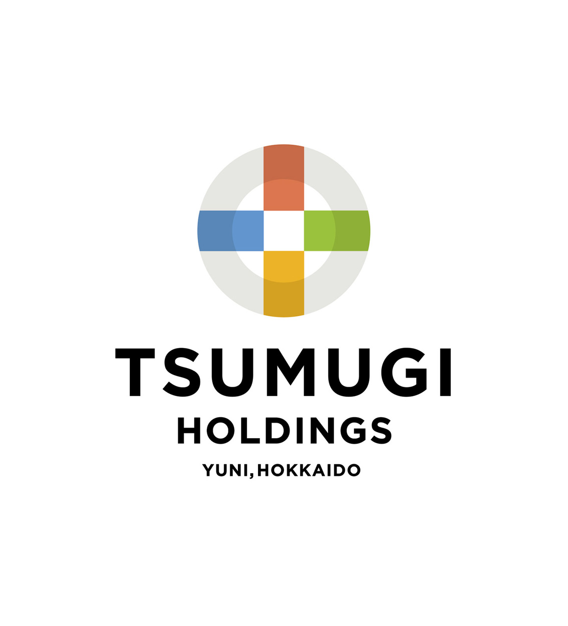
つむぎホールディングス
つむぎホールディングス
2026
- AD,D Masayuki Terashima
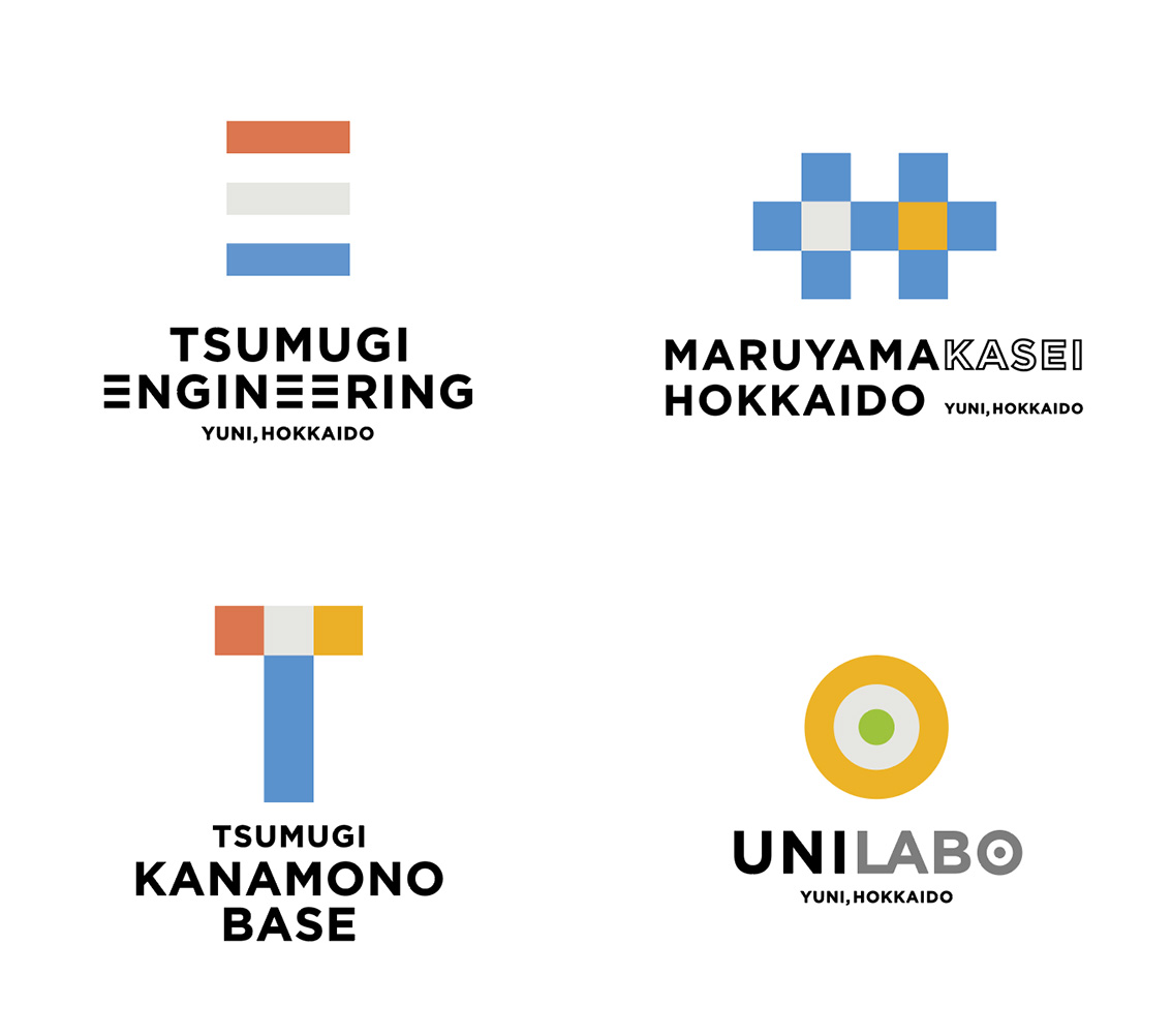
由仁町で丸十越後屋呉服店として1904年に創業し、その後、金物店となり、さらに建築資材をそろえる総合店に進化していった「丸十わたなべ」。その120周年ロゴを渡辺社長からお願いされたのが2024年暮れのこと。鉄骨製作の栄進工業、土木が得意な喜多村建設、化学の会社 丸山化成北海道など4社をグループに加えることを伝えるマークにしてほしいというオーダー。そこでグレーの「丸」に「十」の文字を重ねて、4社を4色で表現することに。新しい名刺やピンバッジも納品してデザインの仕事はひと段落と思っていたら、「ホールディングスにして、各社の社名も変えるので、ロゴデザインを一新したい」と渡辺社長。メインとなる会社は「つむぎホールディングス」。栄進工業と喜多村建設は合併して「つむぎエンジニアリング」に。もともとあった金物店も名前を変えて「カナモノベース」に。そこに「ユニラボ」という会社を加えてリニューアルすることに。120周年のシンボルマークはメインとなるホールディングスが引き継いで、グレー+4色を割り振りしてデザイン。丸十ロゴで使った正円と四角形の組み合わせだけで作ることをルールにして、グループ各社のつながりを感じるデザインにしてみた。社名も「つむぎ」だからね。一枚の布がつむがれて、どんどん大きくなっていく、みたいなイメージかな。たぶんこんなにシステマチックな企業ロゴは少ない気がするから、新鮮に感じてもらえるとうれしいね。ここまで振り切ったデザインを受け入れて喜んでくれた渡辺社長は、このロゴたち以上にユニークで明るくて行動力のある人。由仁を中心に面白いことを仕掛けていくのは間違いない。創業122年を迎える2026年の元旦、新体制がスタートした。
Maruju Watanabe began its journey in Yuni, Hokkaido, in 1904 as Maruju Echigoya Kimono Store. Over the years, it evolved from a traditional clothing retailer into a hardware store, and eventually into a comprehensive supplier of building materials and construction-related products.
Toward the end of 2024, President Watanabe approached me with a request to design a logo celebrating the company’s 120th anniversary. The mark needed to represent not only Maruju Watanabe itself, but also the four companies that would form its growing group: Eishin Kogyo, a steel-frame manufacturer; Kitamura Construction, known for its civil engineering expertise; Maruyama Kasei Hokkaido, a chemical company; and Maruju Watanabe. My solution was to place the character “十” (ten) over a gray circle representing “Maru,” while expressing the four companies through four distinct colors.
After delivering the anniversary logo, along with new business cards and lapel pins, I assumed the project had come to a close. Then President Watanabe returned with an even bigger idea.
“We’re becoming a holding company,” he said. “The company names are changing, and I’d like to redesign all of the logos.”
The new parent company would be called TSUMUGI Holdings. Eishin Kogyo and Kitamura Construction would merge to become TSUMUGI Engineering. The long-established hardware business would be renamed KANAMONO BASE. In addition, a new company called UNILAB would join the group.
The 120th anniversary symbol would live on as the foundation of the new holding company’s identity. Building upon that concept, I developed a system using gray plus four assigned colors. One design rule guided the entire project: every logo would be constructed solely from circles and squares—the same geometric language used in the original Maruju symbol. By sharing these common elements, the logos visually express the connections among the group companies.
The name “TSUMUGI” itself suggests the act of spinning threads. I imagined a single thread being woven into a larger and larger piece of fabric, growing through connection and collaboration. That image became the underlying idea behind the identity system.
I suspect there are very few corporate identity programs that are this systematic, which is precisely why I hope people find it fresh and memorable.
Of course, the person who embraced such a bold design direction is even more unique than the logos themselves. President Watanabe is bright, energetic, and remarkably action-oriented. I have little doubt that he will continue launching interesting projects centered around Yuni and beyond.
On January 1, 2026—the year the company celebrated its 122nd anniversary—the new organization officially began its next chapter.